Art + Engineering & Science

Today, people generally tend to think of art as being at the opposite end of the spectrum from math & science. However, the two “sides” are actually quite related, even though modern thought has separated them. Think of it: at the time that St. Peter’s Basilica was built (1506-1625), artists were responsible for both fine arts and engineering. There was not such a cultural divide between the two. Michelangelo, Gian Lorenzo Bernini, and Carlo Maderno were among the handful of architects responsible for this immense and potentially dangerous structure.

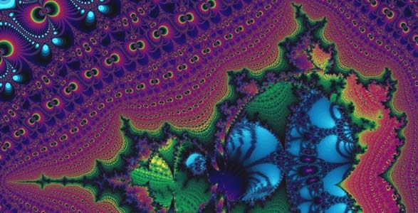
Even now, if you choose to look for it, you can see how art has its ties with math and science. Fractals are a prime example. Pictured below is an example of the beauty that can be achieved through fractal art. If you’d like to learn more about fractals, I would highly recommend visiting the website for the Fractal Foundation, from which the graphic below was obtained.

fractal

Last year, as a part of my art studies, I completed a series of art that was inspired by my years studying engineering at New Mexico Tech. All of the ten (10) pieces are clocks set inside a stretched canvas, and each depicts one or more concepts from engineering, math, or science.

The first one that I completed is entitled Mohr’s Day in the Life. This piece is inspired by the concept that personal stress can be cyclical within a day. I determined the potential times for max & min social stress (tau), and max & min work stress (sigma), and used these–instead of engineering normal/shearing stress values–to build a Mohr’s circle. Then, I utilized a 24-hour clock (rather than a traditional 12-hour clock).

1

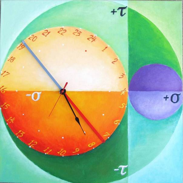
Mohr’s Day in the Life; acrylic on canvas, wood, & working 24-hour clock; 20″x20″; 2015.

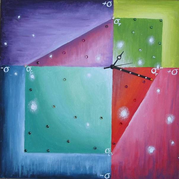
The next piece in this series derives its shape from an infographic used to calculate the relationship between power, voltage, current, and resistance. Each of the four variables has three ways in which it is calculated, so there are twelve equations and twelve wedges to the wheel. Superimposed on these are twelve colors of the color wheel, and four quadrants that represent the four seasons. The “hour hand” is wheel-shaped, and rotates at the center of the clock.

3

Electric; acrylic on canvas, cardboard, Swarovski crystals, & working clock; 20″ x 20″; 2015

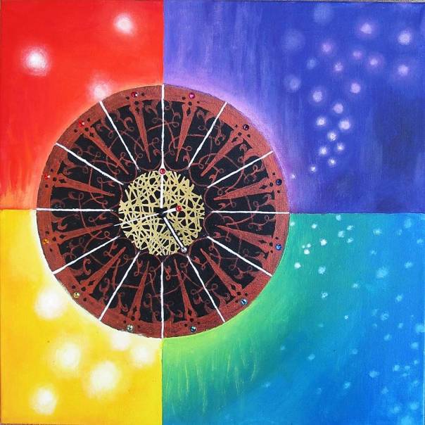
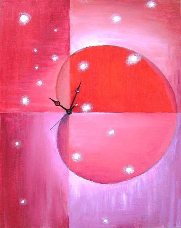
The next clock builds on the concept of stress & time, this time using a hypothetical diagram for Mohr’s criterion. The minute hand always stays within the “safe” area, even though it reaches the edge at two points.

2
Breaking Point; acrylic on canvas, cardstock, Swarovski crystals, & working clock; 20″ x 20″; 2015
The main shapes featured in this next piece are derived from the Amperian loop model. This model involves a ring of current at the center of the field that produces magnetic field lines as shown. The resulting shapes seem very arachnid-like…
4
eCrawler; acrylic on canvas, Swarovski crystals, & working clock; 20″ x 16″; 2015

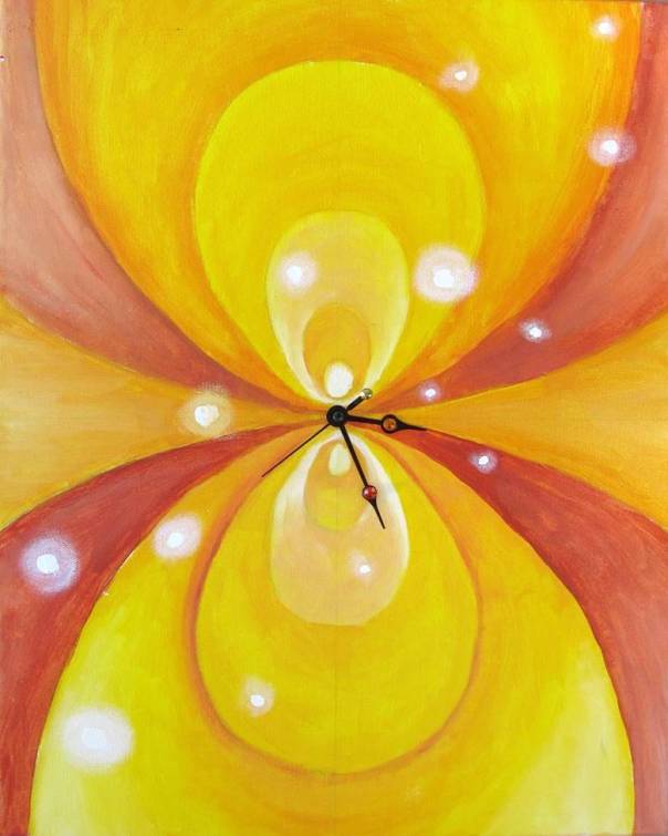
The next piece continues the use of magnetic field lines, this time with those of a bar magnet. It relates the concept of magnetic attraction with the concept of “attracting wealth” that is utilized by some self-help gurus. The magnetic bar in the painting is painted gold, so is also a “gold bar,” and crystals are placed at the hour points of the clock. The placement also switches the traditional emphasis on 12, or 12 and 6, as reference points, and focuses on 9 and 3 (9, specifically, as the start of the traditional “9 to 5” workday).

5
Attraction; acrylic on canvas, wood, Swarovski crystals, & working clock; 16″ x 20″; 2015

One of the beauties of the cyclical clock is that it blends quite perfectly with the polar coordinate system. The following piece features a polar coordinate shape known as a cardioid, so called because it is vaguely heart-shaped. In the real world, the 3-D rotational version of the cardioid is present in sound technology. It is the shape of what a traditional microphone “hears” when it is at the origin of the coordinate system.

6
The Heart Listens; acrylic on canvas, Swarovski crystals, & working clock; 20″ x 16″; 2015

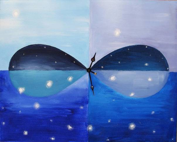
Another polar coordinate shape is the lemniscate, also known as the infinity sign. Day and night skies are featured on both the top and the bottom of this next clock, which can be configured in this position, or rearranged to be hung upside-down.

7
Timeless; acrylic on canvas, Swarovski crystals, & working clock; 16″ x 20″; 2015
In polar coordinates, a “constant” equation (r = 3, or r = 79, for example) translates as a circle. I’ve used the concept of the medicine wheel (and the four cardinal directions, four seasons, etc. that it represents) to further the idea of constancy. The “hour hand” itself is a four-quadranted wheel that rotates.
9
Constant; acrylic on canvas, cardstock, Swarovski crystals, & working clock; 20″ x 20″; 2015
This next piece features the “rose curve” from polar coordinates.
10
8 Petals; acrylic on canvas, Swarovski crystals, & working clock; 20″ x 20″; 2015
There are so many wondrous shapes in civil engineering, one of which is the traffic cloverleaf. I’ve taken this shape and depicted it in the colors of a campfire–bright flame reds and oranges, set off by deepest charcoal blacks fading into snowy, ash white. The four cardinal directions, as a symbol of traveling, are incorporated into the 12, 3, 6, and 9 points of the final clock of the series.
11
The Journey; acrylic on canvas, Swarovski crystals, & working clock; 20″ x 20″; 2015
Are you a fan of art & science as a team? Let me know in the comments below! 🙂

A New Adventure: Etsy

I’ve finally decided to get some artwork and handicrafts on Etsy for sale. Here’s a link to my shop. 🙂 Right now, have just started with handcrafted pillows and treasure boxes (my favorite since I was a child), but am looking to move on to jewelry, prints, and who knows what else in the future!

Here are some pics from the work I’ve done so far:

image

Covered pillow with pieced quilting fabrics… The bright warm colors coupled with the animal print convinced me to title it “Saharan Sunset.”

image

Covered pillow with pieced quilting fabrics and grosgrain ribbon… It’s called “Why the Caged Bird Sings.”

And, last but not least, my favorite items to create: treasure boxes. The aqua and brown box is called “Wind & Sea,” and the green one is called “Sherwood Forest.” Both have a fabric lining. 🙂

image image

The interior (teal velour):

image

Here are a few of “Sherwood Forest”:

image

The inside is trimmed with a braided trim in off-white.

image

I’ve had a great time making these… If you’ve enjoyed any of my artwork in the past, would you please be so kind as to comment any ideas of what I should make next? Thanks so much! ^_^

Self Portraiture

“You are your cheapest model.”

-Unknown

The final project for my Painting I course was a self-portrait, done on a large-scale (~24″x30″) stretched canvas. Building the stretchers, cutting and stretching the canvas, and priming/sanding it was part of the course.

The piece needed to be conceptually complex–we were also being taught to use photo manipulation as a preparative tool for painting. I had the pleasure of being introduced to one of the most delightful photo manipulation programs. It is free and affords artists many of the same functions as typical photo manipulation software packages like Photoshop. The artist doesn’t even have to download software–it is self-contained on the website pixlr.com. I would highly recommend it–it has allowed me to perform many necessary, high-quality, quick photo-fixes that I would not have been able to perform otherwise.

There was an exercise that went along with the assignment, and involved thinking of a time when a very strong emotion was experienced. This emotion and experience was further explored through journaling.

At the time–and in recent times–I was dealing with a strong sense of nostalgia and an overwhelming amount of memories. The foreground of my painting–the figure itself–was taken in front of a window. I tried to capture the feeling of nostalgia with my expression and body language. The background of the painting–a sunrise in Socorro, NM–encapsulated the strong impression of beauty that we can have when viewing the past. Like a photograph, memories can never be fully complete. There will always be things that we don’t know and perspectives we didn’t have. There is always something just outside the frame of the camera, outside of our line of sight–that we can never recover because it was never observed or recorded in the first place.

I can see the incredible beauty of the sunrise because it was in the frame when I took the photo, but I can’t look back and see the other, perhaps less-than-perfect parts of the environment. It doesn’t matter–the image recollects some of the most lovely moments that I have ever experienced. Safely in the future, I can forget the less-than-perfect parts and love the others for what they are in my memory.

image

Once the manipulated photo that I was going to use was complete, I sketched the image onto the canvas and got to work, painting in oil paints. It took quite some time, a lot of paint, and much frustration, but I finally arrived at a stopping point.

2

My portrait could by no means be mistaken for the original photo, but its image has often been mistaken for one (by those who have never seen the original). I’d like to think that I’m good at capturing the spirit of people. It is entirely possible to take photos of people that look nothing like them, and it is quite common to encounter drawings that do not resemble the original subject. My painting does not look like the photo, but that does not mean that it isn’t a good likeness of the original subject. For example, in the painting, I painted my face with the chin tucked a little lower than it was originally. That does not make the painting “wrong”–who’s to say that my chin wouldn’t be lowered by that much? That’s just my philosophy (or perhaps I’m rationalizing my own shortcomings–you decide… 😉 ).

I am ashamed to admit that I ran out of time, but I was forced to leave two areas of the painting under-developed: the ear and the lower right portion of the sunburst. I still have not finished these regions (despite having “finished” the piece about six months ago). Perhaps I will, someday. 🙂

“Old Master” Painting

Yes, the age-old “learn by copying” method of art instruction. In the Painting I course that I took, we used this method in the “Old Master” project. Each student was allowed to choose a centuries-old (and therefore,  copyright free) oil painting to copy. My indecisiveness was palpable… Girl with a Pearl Earring? La Belle Ferronniere? Dominique Ingres’ Self-Portrait? I finally settled on El Greco’s Lady in a Fur Wrap.

Lady in a Fur Wrap

The first step was to create the reference materials for the project. I printed a color photograph of the painting and created a black and white poster (using the ever-useful blockposters.com) of the artwork that was scaled my masonite board.

Layering the poster on top of graphite transfer paper and the gessoed board, I traced the major areas and borders of the painting.

Old Master 1

Then, the painting commenced. Where to start? My painting instructor–who does a great many “Old Master” paintings–always starts with the eyes. It makes sense–in any kind of drawing, we must select a portion that we will “believe” (as my Drawing II instructor says), and base all other placement and relations on that part. The eyes are one of the most important parts of the painting. When executed skillfully, they can make a painting real, even if the rest of the face isn’t fully developed. Still, viewers can recognize immediately if they are a little “off.” I began, painting the eyes first. The color photograph was absolutely indispensable in matching and mixing colors.

Old Master 2

During the next class period, I continued with the face, working outward.

Old Master 3

I started to paint the lady’s gauzy veil during the next session. The veil has icy white portions, but since I was working wet-on-wet, it was difficult to get the bright white. I lumped the paint on in an attempt to keep it white.

Old Master 4

I ventured into the black of the background when I returned to the piece, down onto the lady’s dress, and even made my way to her hand. While it was difficult to achieve a bright white using a wet-on-wet technique, it was nearly impossible to achieve deep dark shadows on the gauze covering the lady’s upper chest area. After being frustrated for several hours, I reached the crushing realization that I would be darkening the shadows another day. In case you’re wondering, the white area in the upper left corner is where I taped the color photograph of the painting while I worked. It is much easier to copy a work (or match colors) when your piece is physically as close to the reference material as possible.

Old Master 5

El Greco achieves this amazing “fur” effect by layering his paint. I was, then, not about to complete the fur shawl using a wet-on-wet technique. During the next session, I painted the under-painting for the shawl and sleeve cuff. I also added more detail to the hand.

Old Master 6

The fur, while somewhat satisfactory, was not what I was looking for. Perhaps what I lacked was a small enough brush (most likely the case–none of my brushes were small enough for fine lines), but it was very difficult for me to attain feather marks that were small enough. I left it vague and soft in form. I also added highlights to the sleeve cuff, the hand, and the ring. I fixed the face a little (one should always be open to improvement and revision).

Old Master 7

The final step was to fill in the rest of the black background and complete the finishing touches.

Old Master 8

Although I am somewhat happy with my copy, it is very clear that I am no art forger. In fact, in creating the featured image for this post, I placed my copy back-to-back with the original and noticed two things immediately: 1) my piece lacks the high degree of detail that El Greco was able to achieve, and 2) my Lady in a Fur Wrap appears almost mirthful, as if she is just about to laugh. Perhaps she is laughing at me and my attempt to paint her. “Yes,” she would say, “you’re ok, but you’re no El Greco.”

The Ladies in Fur

Six Squares: Socorro Plaza

It’s been a while since I’ve posted, although it doesn’t feel like it… It was quite a shock to see that my last post was from January of this year. So much has happened, but first I’d like to share with you some work from the rest of my semester in Painting I.

First image: a “six squares project” to demonstrate mastery of six painting techniques/color schemes. The assignment required six 6″x6″ squares of wood panel. The finished project could either be six parts of a cohesive image (the format that I selected), or the same image executed in different techniques. When I find the original photo that I used, I’ll be updating this post by adding it–just so you can see the image I worked from.

It was quite difficult to chose a photo that I thought would suit this project, mostly because two of the “techniques” were analogous colors and complimentary colors. The photo that I chose featured complimentary colors (red and green) in the top right corner and analogous colors (green, yellow-green, and yellow) in the lower left corner, so those two squares were already spoken for.

Socorro

The other four techniques were palette knife (top left), sgraffito (middle left), glaze over grisaille (middle right), and dry brush scumbling (lower right).

The other reason that I chose this photo was because I took it about a year ago in Socorro, NM (where I went to college for Engineering & Business Management). There were many things that were not ideal about my time in Socorro, but the town still feels like an old friend. It’s like that person that you said you never wanted to see again, but still miss every day… 😉

The palette knife painting was done in just one layer, but the remaining three painting techniques required some degree of layering. Here are the under-paintings and the finished products, just so you can get an idea of what each technique looked like at each crucial point.

SGRAFFITO

Sgraffito utilizes an under-painting that is first allowed to completely dry. Then, the next layer of paint is applied and a tool is used to scratch through to the first layer, exposing the color of the under-painting in scratched marks. I used vibrant color blocks for the under-painting that allowed me to take advantage of some brighter colors once my somber topcoat was applied.

Underpainting for Scraffito Socorro SquareScraffito Socorro Square

GLAZE OVER GRISAILLE

The word grisaille is derived from the French, and essentially means that the artwork has been completed in grayscale. The technique of glaze over grisaille, then, requires completing a painting of the image in full-value grayscale, allowing it to dry, and then adding color with thin coats of transparent color. Some oil colors are transparent, and some are not, so it was very important to keep that in mind when glazing the painting. An opaque paint would muddy the finished product. This technique–while amazing–is not my favorite. I’m used to a crisp image, and was frustrated by the way that the glazes wanted to travel all over the piece. Still, I came to peace with the end result. 🙂 Here is the grisaille, followed by the finished product.

Grisaille Socorro SquareGlaze over Grisaille Socorro Square

 SCUMBLING

This technique was one of my favorites. The under-painting for scumbling requires a thick, textured application of paint, painted in blocks (like a sgraffito under-painting), with little detail. Once the under-painting has dried, paint is applied by dragging the brush over the textured surface. Here is the under-painting, followed by the finished product (which has, unfortunately, been a bit “washed out” by the lighting present when the photo was taken).

Underpainting for Scumbling Socorro SquareDry Brush Scumbling Socorro Square

The six squares project took an interminable amount of time. Still, as with almost any permanent project, memory of the work (and pain and suffering) required will fade with time, but the piece will still remain fresh.

Palette Knife Painting

Yesterday I painted my first palette knife painting in Painting I class. It was a one-session deal, so we had about 2 hours to start and finish the piece. We were working from an organic still life, so there were several items to choose from (a pomegranate, bell peppers of differents colors, a pear, an avocado, a pineapple, an artichoke, etc.). Each was placed on colored construction paper (to give us more color to work from).

I’ll give you a little idea of what palette knife painting is all about (just in case you’re not familiar with it). The paint is applied to the canvas only with the aid of palette knives–blunt or sharp utensils that can be shaped like spades, butter knives, or spatulas. It is a bit like icing a cake. It can also be one of the most aggravating art experiences.

The most beautiful thing, though, about working with this technique is the mindset that one must adopt in order to relax into the process. Nothing is ever ruined and everything is fixable. Colors may go in entirely different places than where you intended them to be, they may mix when you don’t want them to, or you may put the wrong color on the painting. It doesn’t matter–it was bound to happen anyway. Just keep moving forward and thinking about the next step: what can I do next to make this painting even more like the painting I want it to be? To me, it seemed like a metaphor for life. Mistakes happen–that’s what makes this life so beautiful. Just keep moving forward; you can fix almost anything.

It was a very spiritual experience. I felt so relaxed, zen, and in control after entering this mindset. 🙂

Here is my piece. I painted the artichoke.

Palette Knife Painting